Thank you very much for visiting. Advanced criticism and professional advice are strongly encouraged.
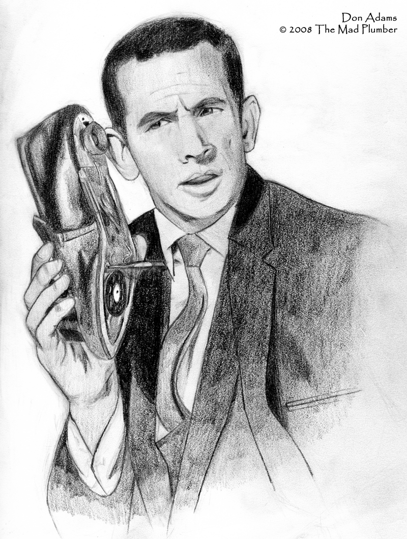
I started this sketch back when I was working at the engineering firm. I downloaded this Don Adams production photograph to my work terminal and worked on this in my sketchbook during my lunch hour. This goes back to my drawing efforts in high school when I tried drawing photographs of significant political figures such as FDR or Hitler, but drawing them in an incorrect fashion and certainly not utilizing adequate graphites. Don Adams as a subject was a totally random choice and a desire to keep things light.
Those of you with Photoshop can certainly see my most egregious follies that I wish I had detected earlier. When I got further into finishing this sketch, I found out how much more disproportionate this was than I originally thought. The face, however, was what bothered me the most and I felt that no matter how hard I tried and how much I added and refined, I could not make the face look like Don Adams'. Then it struck me: "Don Adams has a big head and little beady eyes." Hence, we go back to my disproportion. To me, Don Adams in this sketch really looks like your typical WASP.
Since I realize what my greatest error in this piece is, I probably would appreciate criticism that more centered around the values. I may have completely run out of 8Bs in my efforts to complete this as far as I wanted to. I purchase Kimberly 8Bs because they sell them individually. I also found it really hard to work off of a photo with such miserable resolution.
It is my hopes that my next subject will turn out far better than this one has. Again, thank you for the visit.
Category Artwork (Traditional) / Human
Species Mammal (Other)
Gender Male
Size 800 x 1058px
File Size 604.6 kB
Seeing this forced a smile on my tired face. It's pretty great, and there are a few things that stick out to me in terms of nagging errors, but I am sorry to say that I cannot give any kind of expert criticism since I have never taken a drawing class before and don't know much in terms of art appreciation types of terms. All I can really say is something seems off about the shape of the shoe, but that might have been intentional. There is also something about the way the tie is positioned that suggests it should actually be positioned differently; that is, I don't know of many ties that are made to curve that way.
I appreciate you visiting and taking the time to comment.
I can't comment too much as to what is or isn't proportionate because I don't have the file in front of me right now and I don't really want to bother trying to set it up again. All I can say is that there is this general disproportionalism occurring below Adams' neck, plus his head is too small. I'll try to avoid making the same mistakes twice.
As for Adams' tie, Adams may have been sitting on a stool during this photo shoot and that would explain why his tie is like that.
Again, thank you for visiting.
Fairly stylized so it kind of misses the mark of realism. But the shading is very nice, I am starting to think that your strength lies in tone control as opposed to outright illustration (kind of like mine, which lies in the realm of animation and composition as opposed to outright illustration.). But the image is nice and very well constructed, I just wonder if there are places where line takes over where shadow should be. It's hard to tell, mainly since tone and contrast are difficult subjects for me. There is certainly makings of further developed potential. I congratulate you and hope you continue to grow!
Anyone can be an artist, not everybody should!
Anyone can be an artist, not everybody should!
"Chief? I told you never to call me on this shoe!"
I cannot offer any truly professional critique, as nothing looks truly off about this picture to me. I'll say, however that it's very well done, and having watched a number of Get Smart reruns this was a welcome thing to stumble across. b]
I cannot offer any truly professional critique, as nothing looks truly off about this picture to me. I'll say, however that it's very well done, and having watched a number of Get Smart reruns this was a welcome thing to stumble across. b]
What is mostly "off" about this sketch is the proportion of Adams' head to the rest of his body; if you did an overlay with Photoshop, you could see the problem.
It's probably not all that bad of a sketch, but it just doesn't strike me as great or even good. However, I am glad that you have enjoyed it and could make a thoughtful critique. Thank you for visiting.
It's probably not all that bad of a sketch, but it just doesn't strike me as great or even good. However, I am glad that you have enjoyed it and could make a thoughtful critique. Thank you for visiting.

 FA+
FA+




Comments