★ ★ ★ ★ ★ ★ I'm taking commissions ★ ★ ★ ★ ★ ★
And any critics are welcome.
Suggestions and all your thoughts
Even if I won't respond ))
Your silence doesn't help me improve my art :P
And any critics are welcome.
Suggestions and all your thoughts
Even if I won't respond ))
Your silence doesn't help me improve my art :P
Category All / All
Species Unspecified / Any
Gender Any
Size 571 x 984px
File Size 215.3 kB
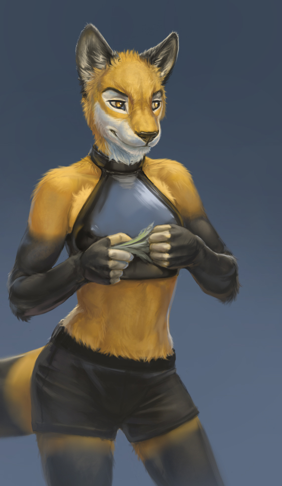
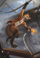
As per usual, your sense of color and value are fantastic. The subtle bounce light on her right (our left) side, combined with the shiny reflectivity of her top really adds a lot of volume to the character, making her seem a lot more lifelike.
There is one minor criticism I can make, though. The way you did the fur for the head/face is quite nice, as is the rest of the body, but they don't really match with each other. You used a lot of hard, high-contrast lines to delineate the fur across the head and face, which really looks quite nice... but the fur for the rest of the body was done in a very soft tone, with very little contrast or hard lines. Perhaps if you added some sort of transition between the two styles of making fur, it wouldn't seem so out of place, but as it stands right now the two styles (while excellent on their own) seem out of place with respect to each other.
I suppose you could have done that intentionally, to help draw the eye toward the face and away from the rest of the body (our eyes naturally gravitate toward areas with higher visual contrast), but without that transition, it doesn't quite work very well. I'd recommend softening the fur texturing along the neck, and adding a few key hardened fur lines/texture along the top of the shoulder/collar-bone area, just to help transition between the high-contrast fur style and the smoother fur style.
They're both good styles, and they need not exist separately, but there has to be some kind of transition between them for the human mind to say "Oh, yeah, they belong on the same body."

 FA+
FA+













Comments